
Best Colors for Resumes: Make a Lasting Impression
Hiring & recruitingBonica
December 6, 2024
Your resume is your first chance to make an impression. But how can you ensure your resume stands out between similar applications?
While content remains king, your resume’s visual appeal plays an equally vital role. One of the most effective ways to improve this visual appeal is by using color.
Color guides the recruiter’s attention and shows creativity in seconds. A splash of navy blue signals trust and dependability! A hint of green suggests innovation and growth!
Research shows that color psychology has an impact on perceptions, and this applies to resumes as much as it does to branding.
Recruiters often spend a minute skimming resumes. In this short window, the right color choice draws their focus to your qualifications.
Colors make your application more memorable. They must be used with intention. Overusing bold hues or clashing combinations creates a distracting appearance.
You need to learn some tips for selecting shades that align with your industry and job role. There should be a balance between creativity and professionalism. There’s always a color strategy tailored for you.
There are also some practical tips for using color effectively. You should understand where and how to integrate colors into your resume design.
Table of Contents
The Role of Colors in Resumes

Color is a powerful tool that shapes how recruiters perceive your resume at a glance. They help you create a memorable document that grabs attention and fits your professional image.
Why Use Colors?
The use of color in resumes is effective because it leaves a strong first impression.
Research shows that humans process visuals far more quickly than text. A nice color draws the recruiter’s eye to key sections of your resume quickly. Color adds clarity to your resume and makes it easier to navigate.
Color also triggers emotions and influences how people see things. A professional tone is conveyed through muted tones like charcoal gray, while creative roles benefit from brighter colors like orange.
It’s crucial to use colors judiciously! Overdoing it leads to an unprofessional look.
Industry Relevance

Not all industries view color in resumes the same way. In creative fields such as graphic design or entertainment, a resume with vibrant colors shows the candidate’s understanding of design principles. Shades like purple or orange stand out positively in these sectors.
More traditional industries like finance or law prefer subdued designs with minimal color. Sticking to neutral tones like black is a safer choice. Using a resume builder can help you maintain professionalism while still subtle accents such as a colored line or shaded section add a polished touch without breaking industry norms.
Color Psychology

Understanding the psychology behind colors helps you make strategic choices that fit the message you want to send.
Green
This color is linked to growth and sustainability. Green is ideal for eco-friendly industries or jobs that focus on growth and harmony.
Purple
It is known for its associations with ambition and luxury! Purple works well for resumes in artistic fields like fashion or photography.
Blue
This is associated with trust and dependability! Blue is a color for resumes in corporate settings or leadership roles. Its calming effect shows confidence and competence.
Red
Red is a bold and passionate color. It signifies action and power! It’s best to use it minimally to avoid looking too intense.
Gray
Gray symbolizes neutrality and balance. I recommend it as a safe and professional choice. It’s used in resumes for managerial or advisory roles.
Select colors that reflect your personal brand while adhering to professional norms.
Best Colors for Resumes and When to Use Them

Each color carries its own psychological weight and visual impact. You need to choose the best colors for your resume and understand when to use them.
Classic Colors
Sticking to classic colors is a safe bet when applying to traditional industries like law or IT. Black, white, and gray dominate this category because they offer a clean aesthetic that shows seriousness.
Black is the essential building block of resume design. It is timeless and authoritative. This color ensures readability and keeps your resume looking formal. Use it for text or headers.
While white is technically a background color, it is crucial for creating negative space. A clean white background with spacing makes your resume easy to skim.
Gray is perfect for secondary text as it adds depth without being overpowering. Use it for section dividers to create a modern yet understated look.
Professional Yet Modern

For leadership positions, colors like deep red or burgundy are the right mix of professional and modern. These shades also show subtle creativity.
Navy Blue is a popular choice for resumes! It symbolizes stability and reliability. It’s effective for management and consulting.
Burgundy communicates sophistication without being overly bold. It’s ideal for roles that need authority, such as project managers or senior executives.
Charcoal and Slate Blue are Modern yet neutral! These shades work well as accent colors to give your resume a contemporary edge.
Creative and Bold Choices

For roles in creative industries like marketing, vibrant colors such as purple make your resume stand out. These colors show a willingness to think outside the box!
Orange symbolizes energy. It adds a dynamic touch to your resume. Use it sparingly for key sections like skills.
Purple is associated with innovation. It is ideal for resumes in artistic fields. It’s bold without being overly aggressive, making it a versatile choice.
Green represents balance. It projects a sense of progressiveness.
Neutral Accents
Consider neutral accents like beige if you want to add a hint of color without straying too far from traditional norms. These colors are great for jobs that require a quiet and sophisticated look, like teaching.
Beige has a soft and professional tone. It works well for backgrounds or small highlights. Beige adds warmth without detracting from the content.
Pastel Shades works, too. Light blues, pinks, or yellows add personality while maintaining a polished look. These shades are useful for resumes in hybrid roles.
Whether you choose classic colors or bold ones, make sure your resume is easy to read and looks balanced.
Colors to Avoid

Using color on your resume improves its appeal and impact, but making the wrong color choices hurts your resume and makes a bad impression.
Simply avoid colors that are too distracting or clashing.
Distracting Choices
Bright neon colors or excessively vibrant shades may grab attention, but not for the right reasons.
Neon green, hot pink, or electric yellow come across as overly flashy and hard on the eyes. Such colors make it difficult for recruiters to focus on the content. They will divert their attention from your qualifications to the design itself.
Recruiters often scan resumes, and distracting colors interfere with readability. These choices show you don’t understand professional standards!
Overloading with Colors

Using too many colors on your resume is another mistake to avoid. While an accent color adds a professional touch, excessive use makes your resume appear chaotic.
Overloading with colors confuses the visual hierarchy! It makes it harder for recruiters to navigate your resume.
A simple rule of thumb is to stick to one primary color for emphasis and one neutral shade for balance. A resume with navy blue headers and gray accents is professional while adding visual interest.
Avoid turning your resume into a rainbow! Recruiters are unlikely to see it as creative.
Clashing Combinations
Choosing colors that clash ruins the overall aesthetic of your resume and reduces its readability. Combining bright red text with a green background or using multiple bold colors together is hard on the eyes and distracts from the content.
To keep your design balanced, use complementary or analogous color schemes. Pairing navy blue with light gray or beige creates a harmonious look.
Prioritize contrast to ensure the text is easy to read. Dark text on a light background or vice versa helps recruiters quickly absorb information without struggling.
Your resume’s primary goal is to clearly show your qualifications. Avoiding distracting colors will help you achieve a polished design. Stick to the strategic use of colors that improve your content, not overshadow it.
Practical Tips and Tools for Choosing Resume Colors

Choosing a color scheme is difficult if design isn’t your forte.
Greatest tools
Luckily, a variety of tools help you with this.
Canva
This tool is known for its user-friendly design templates. Canva offers color palettes that are visually balanced. Simply browse their collections or create custom combinations to suit your style.
Coolors
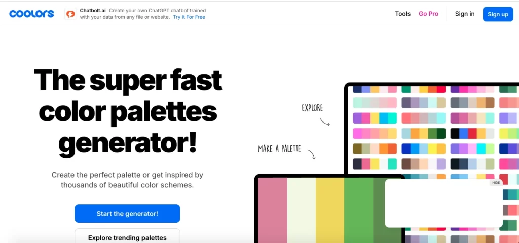
Coolers gives you a chance to experiment with endless color combinations. Lock specific colors and let the tool suggest complementary shades. Cooler is there to ensure harmony in your design.
Adobe Color
Adobe Color enables you to build palettes based on color theory! You have features like analogous, complementary, or triadic schemes. This tool is perfect for unique combinations.
They help you make decisions when you’re not sure where to begin. Remember to consider your target audience.
Testing for Readability

A beautifully designed resume means little if it’s hard to read. Always test your color choices in digital and printed formats.
Many resumes are initially viewed on screens, so check how your colors appear on different devices. Brightness and resolution vary between monitors.
If you’re submitting physical copies, print a sample to confirm the colors look as intended. Vibrant hues that shine on a screen appear dull or too bold in print. Use colors that look good on different devices and in different formats.
Many companies still print resumes in grayscale! Ensure that your design remains legible without color. Test your resume by converting it to grayscale to see if the layout is still easy to follow.
Considering Accessibility
Your resume should be accessible to all audiences, including those with color vision deficiencies. Ensure that no recruiter struggles to read your content.
Pair light text with dark backgrounds or vice versa to maximize readability. Avoid low-contrast combinations like light gray text on a white background.
Don’t use color as the sole means of conveying important information. Underlining or bolding headers ensure clarity even for those who may not perceive certain colors distinctly.
Tools like Coblis or Color Oracle allow you to view your resume as someone with color vision deficiencies. This helps you identify any problematic areas and adjust accordingly.
A Quora Rundown!

Opinions on Quora are as diverse as job seekers themselves!
Keep It Plain for Corporate Roles
Heather Hamilton, a seasoned career recruiter, supports a simple approach.
She thinks recruiters prefer straightforward resumes over flashy designs. “Recruiters don’t want to see fancy designs or colors; they want to find the info they’re looking for without hunting through your document,” she explains.
She also notes that applicant tracking systems (ATS) often struggle with complex layouts, such as those with graphics.
The Role of Company Culture

Bayu Amus, with over a decade of experience in UX design, discusses the importance of customizing your approach to fit the company’s size and culture.
For large corporations, he recommends a conservative layout that is easily scanned by applicant tracking systems. “Put too much non-text element or experimental layout, and you lessen the chance of getting your information properly presented,” he warns.
However, for smaller companies or startups where resumes are often reviewed by humans, adding thoughtful design elements helps with creativity and individuality.
Understanding Hiring Managers’ Preferences
Alice Baker, a former law professor, likens a resume to a professional outfit.
She prefers a minimalist approach: “A resume should be the documentary equivalent of a business suit.”
For her, black ink, standard fonts, and white or cream backgrounds are ideal for showing professionalism.
She says there may be exceptions for creative roles but warns applicants to still be cautious, even in those cases.
Balancing Risk and Reward

Averon Media points out that color choices are highly divisive. While adding color makes a resume stand out, it could also turn off traditional hiring managers.
They briefly mention, “There is a greater chance that a hiring manager will dislike the color and that you will not be considered a serious candidate.”
The Quora community agrees that there’s no one-size-fits-all approach. Your choice to use color or keep your resume plain should align with the role and recruiter’s expectations.
Conclusion
Color is a powerful tool for improving your resume when used properly.
It has the potential to show creativity or even your unique personality, depending on the choices you make. The right color palette helps your application stand out in a crowded job market.
While experimenting with color, it’s crucial to find the right balance. Professionalism should remain your priority!
Readability and accessibility guide your decisions, and tools like Canva and Adobe Color simplify the selection process.
Be bold, but not at the expense of clarity.
Hire the best candidates
with Wetest.
Create pre-employment assessments in minutes to screen candidates, save time, and hire the best talent.
Try for free